Architectural firm design and Content Management System
What is Perkins Eastman?
Perkins Eastman is an international architecture and design firm that provides a wide range of planning, design, and consulting services for clients in various industries. The firm specializes in architecture, interior design, urban design and planning, landscape architecture, and sustainability consulting, and has completed projects in more than 40 countries around the world.
Problem statement:
Perkins Eastman, a renowned organization, possesses a wealth of content, including imagery, textual content, and a comprehensive database. However, they lack a robust Content Management System (CMS) that can effectively integrate all these elements into a modern, responsive, and accessible design.
The absence of a cohesive CMS solution hinders their ability to efficiently organize, update, and present their content to the target audience. To address this challenge, I had been assigned the responsibility of designing and collaborating with the developer to execute and manage the seamless integration of the CMS system with its corresponding dynamic areas.
Solution outline:
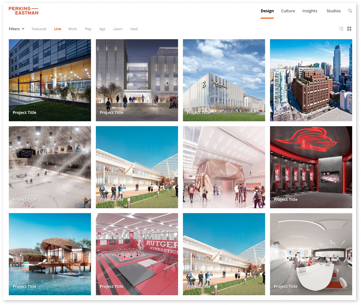
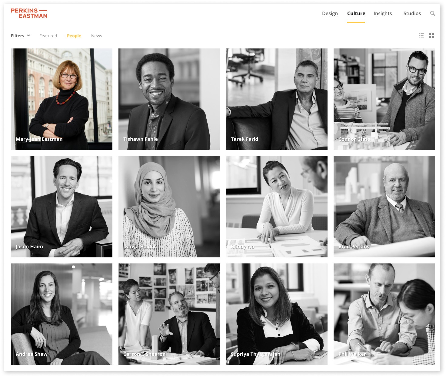
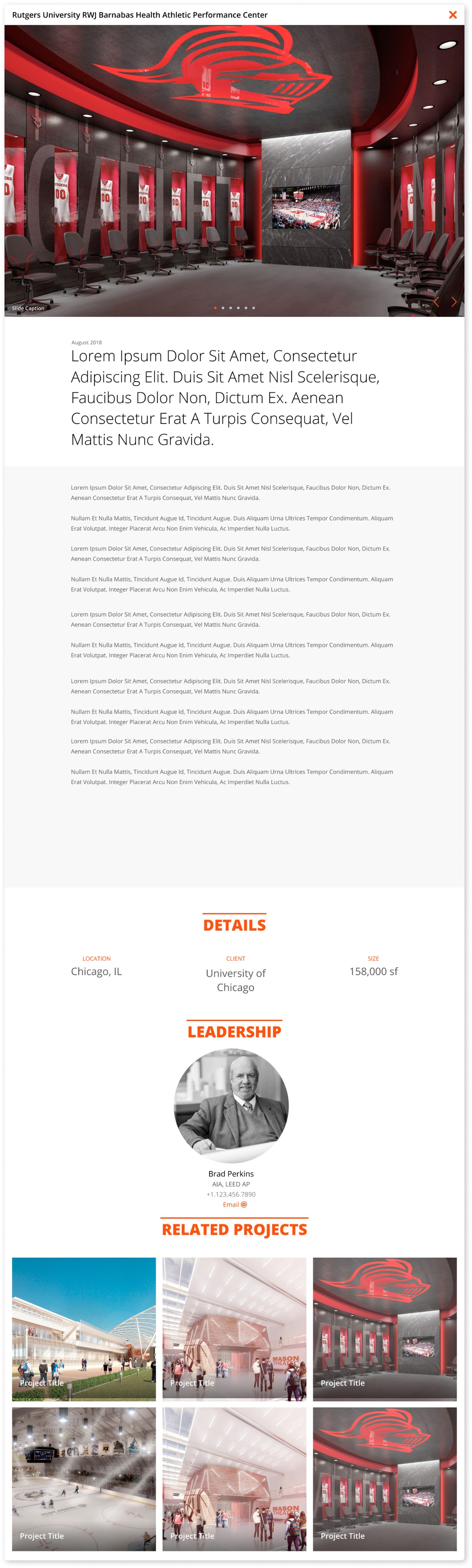
A new CMS site design that would highlight all of the firms accomplishments, projects, locations, and staff while connecting to their already existing database. The site would have to be responsive from the outset.

Understanding the user:
I started the research process by interviewing the client and gathering requirements. This helped me better understand what they were trying to accomplish. The client in this case was the end user and while we were aiming to build a CMS redesign for consumption by the public (meaning it had to be easy to navigate), we also had the added task of ensuring that from a CMS perspective we were properly taking into account all of the information, it's types, and validations for all of the content that would need to be displayed in the collections.
Research insight:
Here were some of the insights gathered from the research:
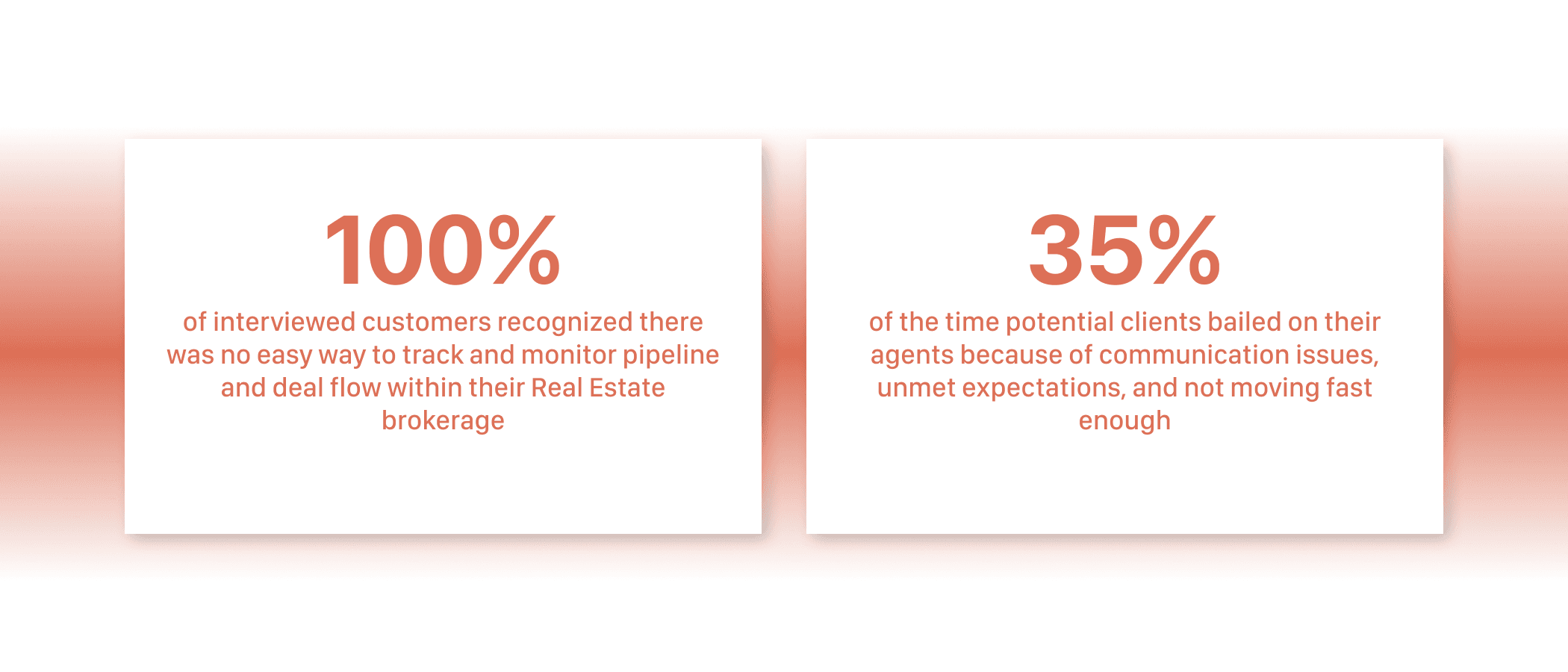
Users wanted an easy and consistent way to enter projects into their CMS
Users wanted a mobile first and fully responsive site
Users wanted a more modern look as their former site was dated
Persona:
Following the analysis of user research findings, the next step was to develop personas, which aided in envisioning the intended audience. To facilitate the design process, I ensured that one particular persona effectively represented a user that was interested in helping understand their business and marketing needs, and who was enthusiastic about improving the workflow process, taking into account their pain points and frustrations.
This persona served as a constant reference point throughout the entirety of the product design journey, helping to maintain a clear focus when making design choices.

User testing:
Before moving on to high-fidelity mockups, I tested the lo-fi mockups with the main point of contact on the project and an additional colleague. Here are some of the improvements made based on user feedback:
Users wanted some color variety between navigation pages and in lo-fi there weren't any colors making it hard to tell one was in a different high level navigation
Users stated some means of filtering projects would be required
Final design:
After taking into account user feedback and iterating on the lofi design, the final design was complete. By adding additional colors from their color paletted to represent the additional high level navigation items gave the site and pages distinction and individuality. Additionally the adding of the filters made it more clear that the grid on the home page was in fact a project grid.