GSE enterprise modernization effort

What is FreddieMac?
Freddie Mac, also known as the Federal Home Loan Mortgage Corporation, is a government-sponsored enterprise (GSE) that was created to provide liquidity, stability, and affordability to the U.S. housing market. The company operates in the secondary mortgage market, purchasing mortgages from lenders and packaging them into mortgage-backed securities (MBS) that can be sold to investors.
Problem statement:
Underwriters have a difficult time keeping up with the back and forth of material documentation (including Promissory Note, Gaurantee, and the Loan Application itself) from the client not always catching information immediately and sometimes further down the process of the loan.
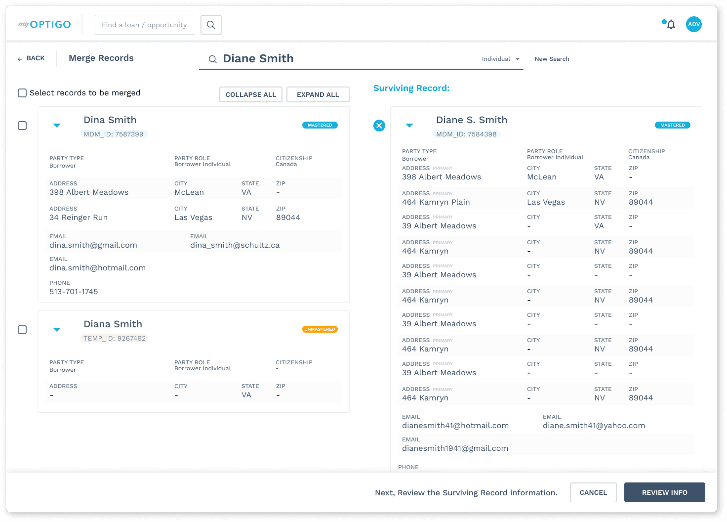
Additionally there was an issue with duplicate borrowers, and so there needed to be a way to master borrowers too.
Solution outline:
A modernization effort that required the effort of several designers including myself where each would work on one piece of a very a large application that consisted of bringing together old datasets and legacy interfaces into one design system (One Roof Design) so that we could consistently be designing new workflows utilizing the same elements.
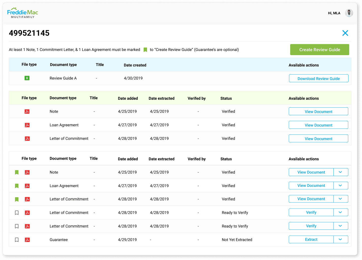
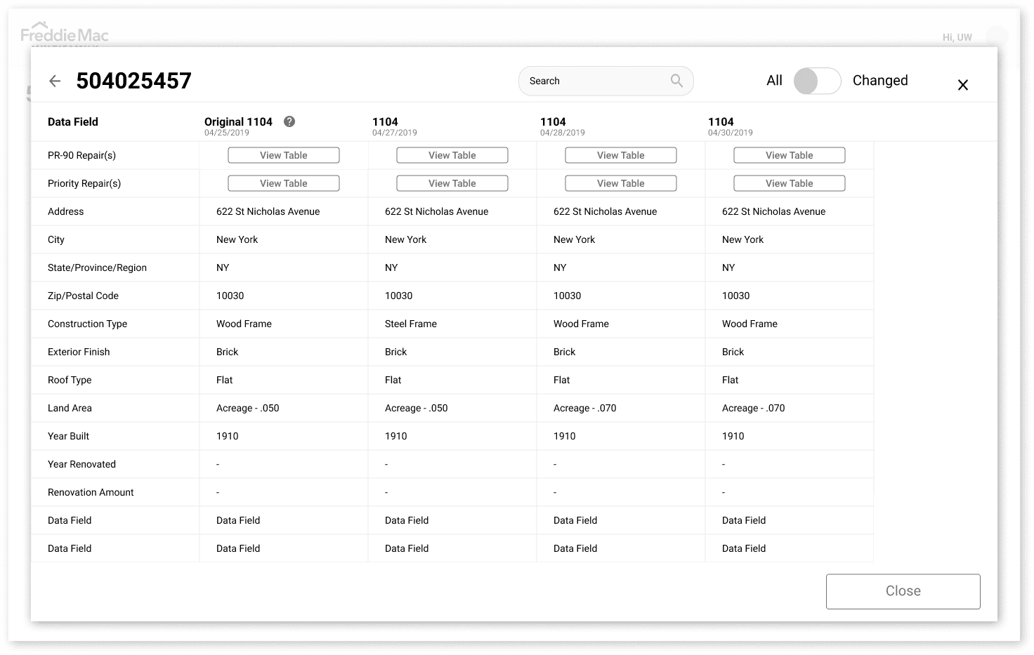
This was really crucial to avoid techincal debt and inconsistencies that can be difficult to target and time-consuming to correct. The applications that I worked on consisted of a Document Digitzation workflow that would extract values from material documents (i.e. Promissory Note, Loan Agreement, etc.), and populate them into a grid in order to compare with legacy versions - given that often times these documents are corrected and sent back and forth which becomes difficult in tracking the updates.
Additionally I worked on a Mastering Data from Borrower workflow, that allowed to visualize duplicates of borrowers in our systems and even get down to the granular level of organizations purchasing properties as private entities. But the focus for this portfolio piece is the Document Digitization effort.

Understanding the user:
I started the research process by analyzing data taken gathered from previous consulting agencies knowing I would also have SME's (Subject Matter Experts) along for the ride on this project and that gave me the ability to ask the SME's directly anything I wanted to know about the user, and their pain points.
This allowed me to better understand what struggles users were facing when working on the underwriting process to approve loans.
Research insight:
Here were some of the insights gathered from reviewing the previous material and discussing with SME's:
Lots of back and forth with the lender documents and this causes difficulties when determining what data changed after every amendment.
Users frequently cited the excessive time it took to evaluate all of the documentation and that it would be a big improvement if the solution could handle all of the core documents in reconciling their information.
Users wanted to be in one system that looked the same rather than have to work with separate and fragmented Java applets.

Persona:
Following the analysis of user research findings, the next step was to develop personas, which aided in envisioning the intended audience. To facilitate the design process, I ensured that one particular persona effectively represented a loan application processor who was enthusiastic about improving the workflow process, taking into account their pain points and frustrations.
This persona served as a constant reference point throughout the entirety of the product design journey, helping to maintain a clear focus when making design choices.
Sitemap:
Afterward, the focus shifted towards conceptualizing the structure of the product mainly thinking about what the functions and main actions required at this particular part of the process.
Given this perspective, I prioritized the use of desktop or laptop computers and proceeded to design a sitemap that visually depicted the primary user journey within the product.

Sketches:
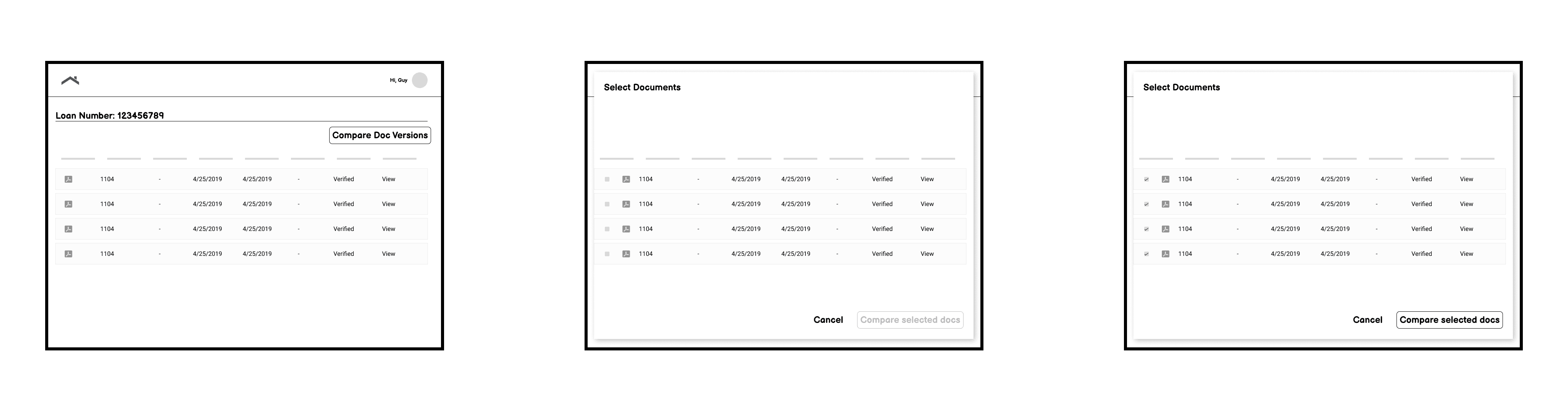
At the onset of the design phase, I initiated the process by creating preliminary sketches outlining the desired page layout. My objective was to enable users to link from the desired document inside of the current document repo and kick off a document digitization process that would allow the user to compare different versions of the same document once the OCR engine was done extracting the content.
Lofi:
With the foundation of the website's structure in place, the next step involved crafting low-fidelity wireframes. These wireframes served as initial representations of each screen's layout and content. Subsequently, these wireframes were transformed into lo-fi prototypes, allowing for a rapid assessment of how the screens should seamlessly flow together.


User testing:
Before working on to high-fidelity mockups, I tested some lo-fi prototypes with some of the underwriters that we had access to via the SME's, in an unmoderated usability excercise. Here are some of the improvements made based on user feedback:
Users suggested that often times documents have various versions, and while it's great to see the updated information on a single form, they wanted to see all updated information on all forms.
Users stated that the workflow was intuitive enough but I wouldn't know for sure until the integration with a third-party service occurred. That company was an OCR vendor (Optical Character Recognition), and while I studied their demo applications to see how it would integrate with our workflow, there were still some unknowns.
Users wanted a clear visual way to see the latest updated version so that they could quickly assess which documents were still outstanding, and that made the work go faster and more streamlined.

Final design:
After taking into account the user feedback, the final design was complete. Because the lack consistency in their processes many underwriters had to write copious notes to remember how to perform certain work functions, so they really liked that they could now work under a uniform UI and be able to perform their work faster and with more confidence and accuracy which was important when packaging loans to sell on the secondary market post-loan.